Example: Tics
The following plotting examples will revisit R’s generic plotting functions and pimp them up a little bit. The underlaying example data is taken from our data set showing the percentage fraction of settlement, recreational, agricultural, and forest areas for each rural district in Germany.
## Loading required package: reshape2
## Loading required package: car
## Loading required package: carData
## Loading required package: plotly
## Loading required package: ggplot2
##
## Attaching package: 'plotly'
## The following object is masked from 'package:ggplot2':
##
##     last_plot
## The following object is masked from 'package:stats':
##
##     filter
## The following object is masked from 'package:graphics':
##
##     layout
## Loading required package: forecast
## Loading required package: zoo
##
## Attaching package: 'zoo'
## The following objects are masked from 'package:base':
##
##     as.Date, as.Date.numeric
## Loading required package: TSA
##
## Attaching package: 'TSA'
## The following objects are masked from 'package:stats':
##
##     acf, arima
## The following object is masked from 'package:utils':
##
##     tar
## Loading required package: Kendall
## Loading required package: dtw
## Loading required package: proxy
##
## Attaching package: 'proxy'
## The following objects are masked from 'package:stats':
##
##     as.dist, dist
## The following object is masked from 'package:base':
##
##     as.matrix
## Loaded dtw v1.20-1. See ?dtw for help, citation("dtw") for use in publication.
## Loading required package: TSclust
## Loading required package: wmtsa
## Loading required package: pdc
## Loading required package: cluster
In a previous example, we have made a box plot with square root transformed data. The boxplot looked like this:
numc <- c("Settlement", "Recreation", "Agriculture", "Forest")
boxplot(lu[, numc]**0.5, main = "Non-transformed scale")
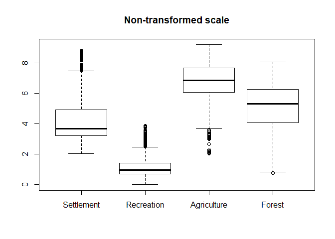
The problem with that plot is that the labels at the y axis are no longer equal to the actual values but to the third power of the square root. Since this is hard to convert back without a calculator, let’s produce a plot which has the same scaling as this one but modified tics (i.e. the points where a label is drawn) and lable values.
# plot the boxplot without y axis tics and lables
boxplot(lu[, numc]**0.5, main = "Transformed scale", yaxt="n")

# get maximum value rounded to the next power of 10 and create a sequence
# between 0 and this value with a length of 11
ylabls <- 10^ceiling(log10(max(lu[, numc], na.rm = TRUE)))
ylabls <- seq(0, ylabls, length = 11)

# transform the power of then values above analogous to the data values
ytics <- ylabls**0.5

# add axis tics and labels to the plot
axis(2, at=ytics, labels=ylabls, las=2, tck=-.01, cex.axis=1)
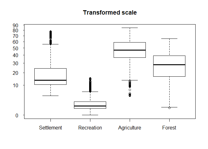
If you look at the code above you will notice that the first thing that has
changed is the yaxt argument in the boxplot function. This argument controls
if yaxt lables and tics are drawn and by setting it to “n”, no axis tics etc.
will be put into the plot in the first place.
The second block of the code round the maximum value to the next power of 10 and creates a sequence between 0 and this value with 11 values. Afterwards, this sequence is transformed in analogy to the data values. This will provide us the location of the tics in the transformed dataset.
Finally, we draw the axis tics and lables using the axis function.