Example: Colours
Before we expand our plotting capabilities, we want to spend a bit more time
thinking about colours and colour spaces. A careful study of colour-spaces
(e.g. Zeileis et al. 2009;
www.hclwizard.org;
www.vis4.net or
wikipedia)
lead us to the conclusion that the hcl colour space is preferable when mapping a variable to colour (be it factorial or continuous).
This colour space is readily available in R through the function hcl().
But before we dive into this, let’s create a function that draws colour palettes:
library(colorspace) # needed for function desaturate()

### function to plot a colour palette
pal <- function(col, border = "transparent", ...) {
 n <- length(col)
 plot(0, 0, type="n", xlim = c(0, 1), ylim = c(0, 1),
      axes = FALSE, xlab = "", ylab = "", ...)
 rect(0:(n-1)/n, 0, 1:n/n, 1, col = col, border = border)
}
Let’s start with a particularly bad example of a colour palette, the rainbow colour palette, sometimes also referred to as jet-colours (that’s Matlab talk).
pal(rainbow(100))
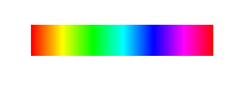
We see that any change that may be happening in the green region will not be noticable whereas changes that happen from red, via orange to yellow will be very prominent even though the underlying data change (let’s assume a change of 5 units) will be identical. This leads to perceived edges in the visualisation which do not reflect real changes in the data.
This becomes even more evident when we plot the colors in greyscale:
pal(desaturate(rainbow(100)))

Such a color scale does not linearily represent continuous data.
There have been numerous attempts to produce perceptually consistent, yet visually pleasing
colour palettes. One very good example of this is colorbrewer2.org
These palettes can be assessed through the R package RColorBrewer
library(RColorBrewer)
brewer_rainbow <- colorRampPalette(brewer.pal(11, "Spectral"))
pal(brewer_rainbow(100))

Most of the edges are gone and the result looks quite pleasing too. To check how effectively this palette takes care of the above observed edges, let’s again look at the greyscale version:
pal(desaturate(brewer_rainbow(100)))

Not bad at all, though there is a distiguishable increase in lightness towards the middle of the scale. This is accepted in this case as this colour scale is a diverging colour scale. This means it should only be used for visualising deviations from a central value (e.g. zero). Do not use this colour scale representing sequential data (i.e. data changing only in one direction)!!
In order to create truely perceptually uniform colour scale we need to use the hcl colour space. As mentioned above, this can be done using hcl(). Here, we create ourselves a function that produces a colour palette of a user supplied length n based on hcl colour space:
clrs_hcl <- function(n) {
  hcl(h = seq(0, 260, length.out = n),
      c = 60, l = 50,
      fixup = TRUE)
  }

pal(clrs_hcl(100))

This looks a bit pale, yet there are no observable edges in the palette. Let’s check the greyscale version.
pal(desaturate(clrs_hcl(100)))

Nice! One evenly distrbuted greyscale without any changes in lightness along the palette. So this is truely a perceptually uniform colour palette where only the hue changes.
One obvious problem with this colour palette is that when printed in greyscale, all values will look exactly the same… To adress this, we can modify our clrs_hcl definition slightly by also varying the lightness (or better luminence) along the same length n along which we change the hue.
clrs_hcl2 <- function(n) {
  hcl(h = seq(0, 260, length.out = n),
      c = 60, l = seq(10, 90, length.out = n),
      fixup = TRUE)
  }

pal(clrs_hcl2(100))

… and in greyscale…
pal(desaturate(clrs_hcl2(100)))

Perfect, a colour scale that is honest, still pleasing enough to not make you want to close your eyes and even in greyscale low and high values are readily discernable.