Example: Visual Data Exploration
Visual data exploration should be one of the first steps in data analysis. In fact, it should start right after reading a data set. The following examples are based on a data set showing the percentage fraction of settlement, recreational, agricultural, and forest areas for each rural district in Germany. The data has been provided through the Regional Database Germany.
Within this example, we will focus on basic R graphics. Of course, all of the example could also be realized using more advanced plotting libraries like lattice or ggplot.
Pre-processing and reading of the data is not shown but the first five lines of the final data set are printed below. Just for simplicity, a variable numc is defined which will be used to subset the data frame to the relevant columns.
numc <- c("Settlement", "Recreation", "Agriculture", "Forest")
head(lu)
##   Year   ID                                          Place Settlement
## 1 1996   DG                                    Deutschland       11.8
## 2 1996    1                             Schleswig-Holstein       10.8
## 3 1996 1001                    Flensburg, Kreisfreie Stadt       47.3
## 4 1996 1002       Kiel, Landeshauptstadt, Kreisfreie Stadt       52.1
## 5 1996 1003           L\201beck, Hansestadt, Kreisfreie Stadt       30.2
## 6 1996 1004                   Neum\201nster, Kreisfreie Stadt       46.4
##   Recreation Agriculture Forest
## 1        0.7        54.1   29.4
## 2        0.7        73.0    9.3
## 3        5.1        25.1    6.0
## 4        1.3        34.7    3.3
## 5        2.9        39.7   12.9
## 6        4.9        46.9    3.4
Boxplot
A boxplot is probably the most fundamental way to perform a visual data exploration. It generally shows the median along with the 25% and 75% quartiles (box and line within) as well as the value range which is within a range of 1.5 times the inter-quartile range (i.e. the size of the box which is also called spread). Values outside the latter range are indicated as outliers. All those settings can be changed.
Producing a boxplot is staright forward (the x-axis lables are just the column names):
boxplot(lu[, numc])
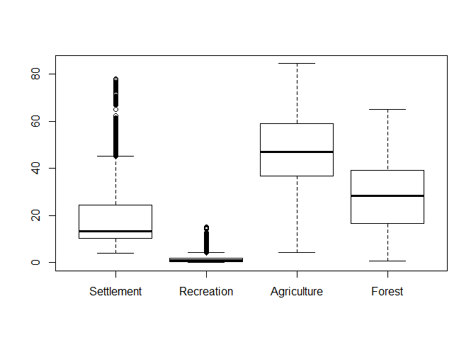
As can be seen, outliers in terms of the box-plot logic are clearly identifieable although this logic does not actually proof if an observation is an outlier. Hence, one has to cross-check the data and if there is no actual sign for an outliers, then keep the data as is! However, since “outliers”” might have a strong influence on further analyisis, one could check some kind of transformation to reduce the value range. The following example shows a root and logarithmic transformation. In order to distinguish the plots, we add a title using the main parameter:
par_org <- par()
par(mfrow = c(2,2))
boxplot(lu[, numc], main = "Original")
boxplot(lu[, numc]**0.5, main = "Square root")
boxplot(lu[, numc]**(1/3), main = "Cube root")
boxplot(log(lu[, numc]), main = "Log")
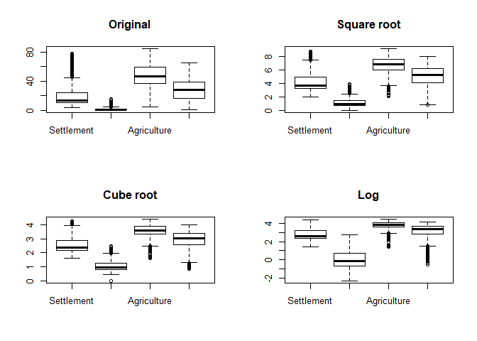
par(par_org)
Histograms
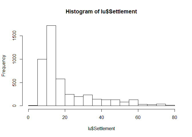
Histograms are usefull for getting an idea of the distribution of the dataset. Visualization is straight forward:
hist(lu$Settlement)
QQ plots
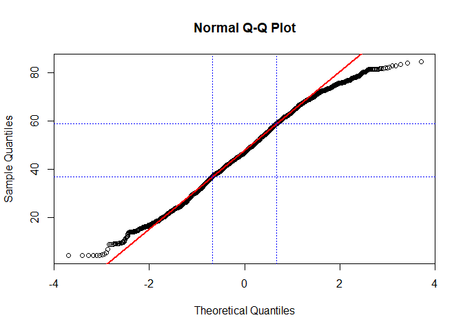
While historgramms just give an idea, QQ plots give a more reliable estimate if a data set follows a specific distribution.
If you are just interested in a normal distribution, you can use qqnorm for this. In order to ease the interpretation, we will also add a theoretical line which runs through the 25% and 75% quartile. If your data does not deviate considerably from this line, chances are high that it actually follows the theoretical distributino used to compute the plot (in the following case, this is a normal distribution):
qqnorm(lu$Agriculture)
qqline(lu$Agriculture, col = "red", lwd = 2)

abline(h=quantile(lu$Agriculture, probs = c(0.25,0.75), na.rm = TRUE), col="blue", lty = 3)
abline(v=qnorm(c(0.25,0.75)), col="blue", lty = 3)
Again, using different transformations might be of advantage (or not in this case!, taken from Zuur et al. 2007):
par(mfrow = c(2,2))
for(p in c(1, 0.5, 0.25, 0)){
  if(p != 0){
    qqnorm((lu$Agriculture**p-1)/p, main = paste0("Normal Q-Q Plot, y**p-1/p for ", p))
    qqline((lu$Agriculture**p-1)/p, col = "red")
  } else {
    qqnorm(log(lu$Agriculture), main = "Normal Q-Q Plot, log(y)")
    qqline(log(lu$Agriculture), col = "red")
  }
}
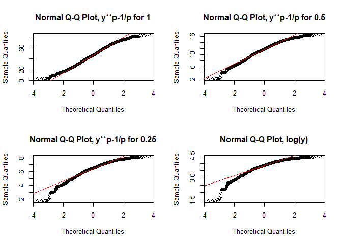
par(par_org)
If you want to use any other distribution, use qqplot instead and provide the distribution to the function. For the line, compute the 25% and 75% quantile and add it with abline. Since the latter function requires an intercept and slope for drawing the line, you have to compute it by yourself or just compute a simple linear model for that using lm:
par(mfrow = c(2,2))
dist <- rnorm(ppoints(length(lu$Settlement)))
qqplot(dist, lu$Settlement, main = "Normal")
abline(lm(quantile(lu$Settlement, na.rm = TRUE, probs = c(0.25, 0.75)) ~
     quantile(dist, probs = c(0.25, 0.75))), col = "red", lwd = 2)

dist <- rchisq(ppoints(length(lu$Settlement)), df = 2)
qqplot(dist, lu$Settlement, main = "Chi squared")
abline(lm(quantile(lu$Settlement, na.rm = TRUE, probs = c(0.25, 0.75)) ~
     quantile(dist, probs = c(0.25, 0.75))), col = "red", lwd = 2)

dist <- rgamma(length(lu$Settlement), shape = 0.6)
qqplot(dist, lu$Settlement, main = "Gamma")
abline(lm(quantile(lu$Settlement, na.rm = TRUE, probs = c(0.25, 0.75)) ~
     quantile(dist, probs = c(0.25, 0.75))), col = "red", lwd = 2)

dist <- rweibull(length(lu$Settlement), shape = 1)
qqplot(dist, lu$Settlement, main = "Weibull")
abline(lm(quantile(lu$Settlement, na.rm = TRUE, probs = c(0.25, 0.75)) ~
     quantile(dist, probs = c(0.25, 0.75))), col = "red", lwd = 2)
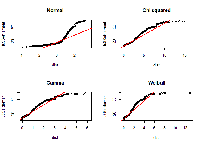
par(par_org)
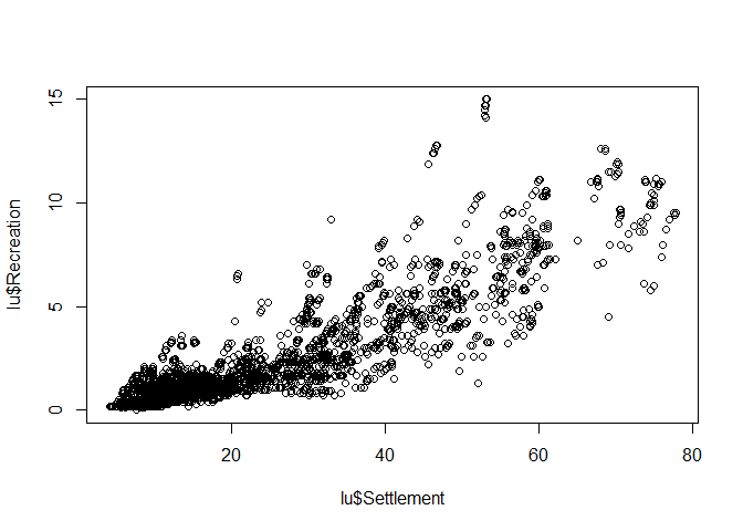
Scatterplot
Scatterplot, i.e. the mother of all plots, focuses on the relationship between variables. The x-axis should be used for the (more) independent variable, the y-axis for the (more) dependent variable.
Again, creating such a plot is very simple:
plot(lu$Settlement, lu$Recreation)
 The axis lables are just the column names of the data frame but for this stage of data analysis, this is more than fine. If you finally decide which graphic should be included in a final presentation (e.g. publication), then the right time for nice lables and other stuff has come. But priot to that, pimping is just a waste of time.
plot(lu$Settlement, lu$Recreation)
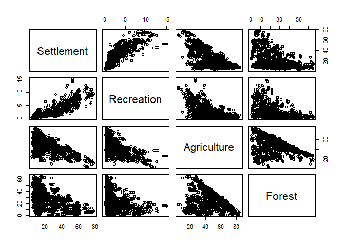
If you are interested in the relation between all (or many) variables in your dataset, just supply the entire data frame or a column subset of it to plot:
plot(lu[, numc])
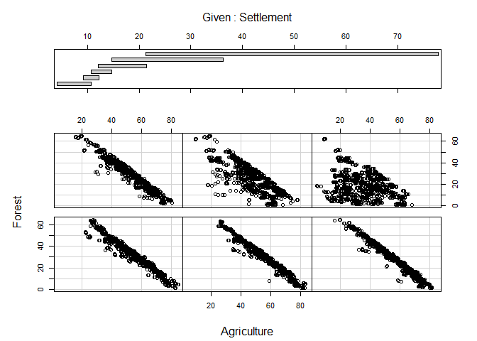
Coplot
As a final example, a coplot might be of some value. It is as scatterplot but the visualized relationship is splitted in accordance to value ranges of (an)other variable(s). The call to coplot is again straight forward. Left of the | are the two variables which will be included in the actual scatterplots, to the right is the variable which is used for the splits. If more than one variable should be used, the variables are combined with a + (not included here because of figure margin restrictions):
coplot(Forest ~ Agriculture | Settlement, data = lu)